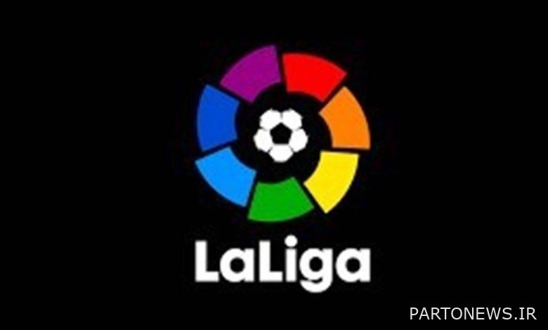
According to Tasnim news agency, the symbol of the first Spanish football league (La Liga) will be displayed in a different form from next season.
Until today, this symbol was known in the form of a seven-color wheel with a soccer ball in the center, from the next season with two letters “L” as abbreviations for the two words La and Liga and of course the full title of this phrase with a new line in red , will be seen.
The previous logo of LaLiga is 30 years old, while other prestigious European football leagues, including the English Premier League, the Champions League, and Serie A, have made changes to their logos in recent years.


Also, LaLiga will be known as LaLiga EA Sports FC instead of LaLiga Santander due to its new commercial agreement with the computer game company EA Sports.
