What is Bitcoin Rainbow Chart?

Finding the right time to buy or sell Bitcoin and other digital currencies is always difficult and depends on adequate research and analysis of recent market trends. We know that one of the best ways to make future decisions is to consider past price trends. Bitcoin rainbow chart is one of the suitable tools for analyzing these trends, which many investors use to predict the state of the market and its turning points.
Bitcoin rainbow chart is a tool for analyzing the price of this digital currency in the long term, which uses a logarithmic growth curve to evaluate the market situation. With the help of its colored bars, this chart highlights market sentiments and provides users with signals to find the best time to buy and sell.
In this article, we will first get to know the basis and history of the rainbow chart of Bitcoin, and then, we will examine how to read the rainbow chart and its difference with the accumulation-to-flow model. Next, we will take a look at the use of this chart for digital currencies other than Bitcoin, and finally, we will point out some of the advantages and disadvantages of the rainbow chart of Bitcoin; So stay with us until the end of the article.
What is the Bitcoin Rainbow Chart?
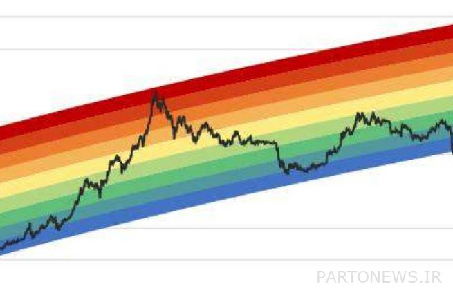
The Bitcoin Rainbow Chart is a simple and easy tool to visualize Bitcoin price movements over time. As the name suggests, this chart uses colored bars to determine when to buy, sell, or hold. In total, 9 color bands can be seen in this chart, with blue color at the bottom end and red color at the top end.
The Bitcoin rainbow chart can give an investor an overview of market sentiment. The upper colors of this chart indicate a bullish market situation and a great time to sell Bitcoin, and the lower colors indicate that the overall market sentiment has decreased and the conditions are ripe for collecting and buying Bitcoin.
This is a logarithmic regression chart that shows how the price of the top cryptocurrency has changed over time. Logarithmic regression is a tool for statistical analysis that examines the relationship between several variables in non-linear graphs. Thus, in this model, the growth or decline of the market is shown at a faster rate at first, and then over time, its speed decreases. In the Bitcoin rainbow chart, the growth or decline of the market is fast at first and then slows down. This chart considers the jump and exponential growth of Bitcoin.
The originator and creator of the Bitcoin Rainbow Chart
The Bitcoin rainbow chart is one of the old tools for analyzing the price of Bitcoin in the long term. In 2014, a member of the Reddit platform with the username “azop” created the first example of this type of chart. This user wrote in the explanation of his chart:
[این نمودار] It’s just a fun way to look at long-term price action, without [کاربران] Get caught up in the “noise” of daily fluctuations.
It is interesting to note that the rainbow chart of Bitcoin initially only had interpretations for three colors: blue for buying, yellow for holding, and red for selling. However, over time different people updated this chart. In the same year 2014, a Bitcoin Talk user named “Trolololo” added a basic logarithmic regression chart to the Bitcoin Rainbow Chart. Then, a third user named Über Holger developed it by adding titles to each of the colored strips, and on the website “Blockchain Center» Uploaded
Difference between Bitcoin Rainbow Chart and Accumulation to Flow Model
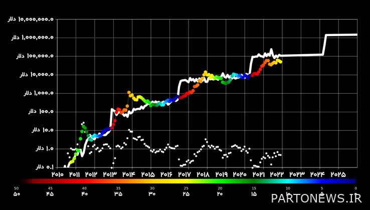
The Stock to Flow model, or S2F for short, is one of the Bitcoin price forecasting tools that measures the relationship between the asset inventory and its production rate. According to this model, the scarcity and the price of Bitcoin are directly related. This relationship explains how a shortage of a good leads to a lower supply and, as a result, an increase in price.
This chart shows the predicted price of Bitcoin with colored dots whose color indicates the time interval until the next halving. Thus, both charts may have a rainbow appearance; But the accumulation-to-flow model is different from the rainbow chart of Bitcoin. This model is drawn based on the Bitcoin halving calendar, and its main variables are the Bitcoin balance and its production rate, and other market variables do not affect it.
Read more: What is Bitcoin halving and how does it affect the price?

How to color chartTheShall we sing the bow?
The Bitcoin Rainbow Chart uses colored bars to represent market sentiment and users’ buying and selling decisions. In general, the warmer the colors of this chart, the more overvalued bitcoins are being sold in the market, and conversely, the cooler colors represent the selling conditions of undervalued bitcoins and the negative sentiment of users towards the market.
For example, when the price of Bitcoin is in the red range, the market sentiment is too positive and it is considered the best time to sell; Because when the price bubble bursts, the price will drop drastically. Conversely, when the chart is in the blue bar, market sentiment is probably very negative and it could be a good time to buy Bitcoin at a price below its true value.
In this chart, the horizontal axis shows the time and the vertical axis shows the price of Bitcoin. Colored bars also indicate market sentiment, which helps users decide whether to buy or sell an asset. Next, we review the meaning of each of these colors:

- Blue: It indicates oversold. This bar is the best area to buy bitcoins; Because it shows Bitcoin at its lowest price.
- blue green: It shows the right area to buy bitcoins. Within this range, Bitcoin is undervalued and has the potential to grow.
- Green: It is still a good place to accumulate and hold bitcoins. This is when the price of Bitcoin is lower than its true value; But it may not have much capacity for growth.
- light green: Within this range, the price of Bitcoin is fairly valued and may still have room to grow.
- yellow: This stage is the right time to take no action and hold on to Bitcoin.
- Bright orange: At this time, Bitcoin is slowly getting ready to increase in price. Here it is better to think about possible bubbles.
- dark orange: It indicates the exacerbation of FOMO or fear of missing out. In this area, Bitcoin is overvalued and the price is likely to fall. When the chart is in the bold orange area, buying Bitcoin is not recommended.
- Red: sell it Bitcoin has experienced a price bubble in this area and has become overvalued. In this situation, buying Bitcoin is not recommended.
- dark red: It shows the maximum amount of bubbles. In this area, the value of Bitcoin is much more than fair and it is not recommended to buy it at all.
Needless to say, this chart is not very accurate and should be used in conjunction with other tools. In addition, since the daily fluctuations of the market have no place in the Bitcoin rainbow chart, it is not considered a very suitable tool for day trading and is usually used as a supplementary tool for long-term investment.
Do color chartsTheDoes Kamani apply to other digital currencies?
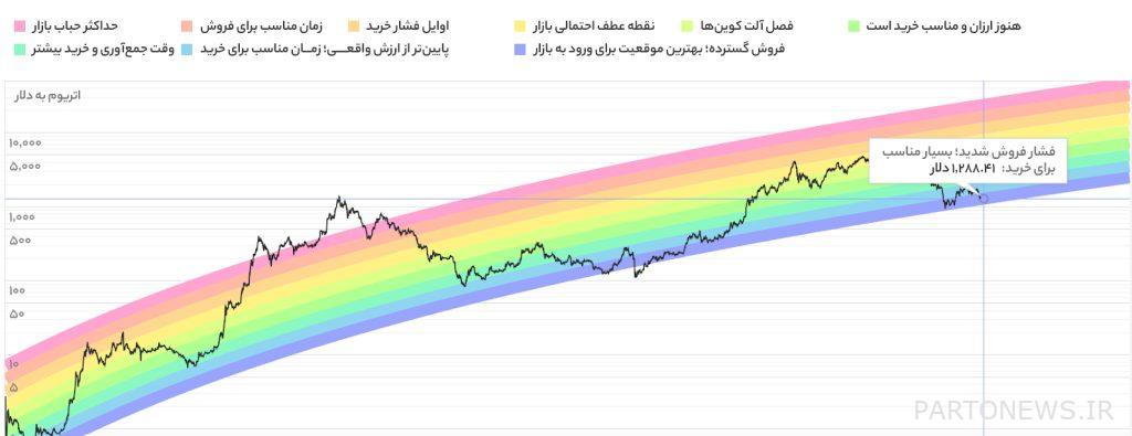
The rainbow chart is also used for other digital currencies such as Ethereum. The creator of Bitcoin’s rainbow chart has created the same model for Ethereum. In this chart, we are faced with different colors that show the state of the ether market at any time.

The rainbow chart of Ethereum consists of 9 colored bars with the following interpretations:
- pink: Maximum market bubble
- Orange: Maybe you should consider selling Ether and reinvesting in Bitcoin
- Bright orange: In the beginning, there is pressure to buy and gradually get ready to sell
- yellow: Possible turning point of the market
- Lime Green: The season of altcoins
- light green: It is still cheap
- green-blue: Time to collect and buy more
- Blue: Less than the real value and the right time to buy
- Indigo: Wide sales and the best position to enter the market
Advantages and disadvantages of color chartTheBitcoin Rainbow
Up to this point, we got to know the general principles of the Bitcoin rainbow chart. Now it’s time to remember that every tool in technical analysis has its advantages and disadvantages. Thus, in addition to using the positive points of each tool, we can take a deeper look to be careful of falling into the trap of its weaknesses. Some of the benefits of the Bitcoin Rainbow Chart are:
- The accuracy of the chart has been more than 8 years.
- The logarithmic regression model is usually efficient for many types of investments in assets that fluctuate to some extent.
- It helps investors to make informed buying and selling.
- This chart is easy to understand for any investor.
Some of the weaknesses of this tool are as follows:
- The rainbow chart is not a good tool for short-term price predictions. This chart only shows long-term price movements and has no scientific basis.
- Although the rainbow chart has largely been correct throughout Bitcoin’s history, there is no guarantee that it will always be this way.
- Some traders may depend their strategy too much on the rainbow chart and do not have a proper analysis of the market situation.
Conclusion
In this article, we explained the Bitcoin rainbow chart and the history of its creation and its difference with the accumulation-to-flow model. Also, we took a look at the meaning of each color in this technical analysis tool and said that this chart with different colors can be used for other digital currencies, including Ethereum. In the end, we reviewed some advantages and disadvantages of the Bitcoin rainbow chart.
One of the constant features of Bitcoin is its relatively extreme volatility, which many investors use to make a profit. Many traders are always looking for the best tool to understand the fluctuations of this digital currency. One of these tools that was introduced in the early days of Bitcoin’s popularity is the Bitcoin Rainbow Chart.
This tool helps investors to examine market changes in the long term and evaluate price fluctuations. Thus, people can have a better overview of the state of the market’s top digital asset and make better decisions. However, we must remember that the Bitcoin rainbow chart should be a supplement to other technical analysis indicators, such as the Fear and Greed Index and the Relative Strength Index (RSI). Setting up a trading strategy based solely on this chart does not seem very logical.

